

PROMOTION IN A CROWDED MARKETPLACE – IT TAKES A LOT OF BOTTLE
In the years after the end of the second world war, malt whisky experienced something of a resurgence. Glenfiddich’s owner was a family concern – William Grant. They knew they had a first class product capable of winning a substantial international audience, but were also aware they were unable to match the huge advertising budgets of the likes of the Distillers Co. Ltd.
For inspiration, William Grant turned to Coca Cola, then as now one of the most innovative, dynamic players in the highly competitive world of drinks marketing. As Coca Cola sought to break out from the soda-fountain business at the end of the 19th century, they needed a unique identity that would differentiate the brand from a host of copy-cat Kola companies.
They hit on the importance of an instantly recognizable bottle that could be easily located on a supermarket shelf with the lights out! The design task fell to Indiana-based, the Roots Glass Company, which after a great deal of research, came up with a heavily embossed bottle in the stylised shape of the cocoa bean. A patent granted in 1915, few would dispute that the Coca Cola fluted contour bottle remains an iconic design for all time.
For Glenfiddich and its portfolio of blended whiskies, William Grant turned to German designer Hans Schleger who had already produced award-winning posters for Shell and Martini as well as the classic London Underground map. Two years in design and prototype production, the William Grant triangular ‘tround’ bottle was launched at a reception at London’s Savoy Hotel in November 1956. It was an instant hit – not least with one visitor who pronounced: ‘What a lovely bottle in which to put a ship.’
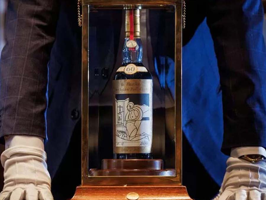
As I write, there is a full bottle of Mortlach 16-year-old on my desk along with its ‘Oxford & Cambridge’ two-tone blue carton. When I have enjoyed the whisky I have no intention of re-cycling the bottle but of re-using it, for it is a thing of deceptively simple architectural beauty; clean, tapering lines with the spirit nestling visibly in a clear, heavy base.
‘I’m glad you like the bottle,’ says Jeremy Lindley, ‘it’s one I’m very proud of.’
He should be. Jeremy Lindley is Global Design Director for brand owners Diageo. ‘With sufficient stocks built up to launch Mortlach as a single malt, we had the privilege of working with a 190-year history. Our first port of call was to travel to the distillery and meet the current team, study the considerable brand archives and consult with local historians. There was incredible richness in the provenance and heritage, and after much consideration we settled on the story of George Cowie and his son Alexander and the remarkable engineering that created the 2.81 distillation process that is still in use to this day, and produces the depth and strength of flavour that led to it being dubbed the Beast of Dufftown.
‘The bottle was designed to reflect the beauty of truly great engineering, where the structure and process is visible and attractive in its own right. The graphics also reflect this engineered approach, giving hints to the complex process and attention to detail required to produce those unique flavours.’
One side of the carton features tasting notes in schematic form, while on the other, there is an illustrated guide to the 2.81 distillation process. Fascinating indeed, but please do not try this at home!